Project Rural Life - Georgetown, NY
We had such enjoyable experience working on this project with the most stylish and sweet client. When we first met with my “Project Rural Life” client, we were not sure where the heck the Google Map was taking us. We passed several farm homes (the real ones, not the trendy ones), featuring clothes lines longer than the world’s longest zip line and we saw far more cows than people. After several months of visits to this home, we’ve come to appreciate the beauty of the area.
This picture doesn’t do it justice, but this is the amazing view from their home. Talk about tranquility!
This newly married couple gave us what every design firm dreams of. A blank slate, a vision, and trust in us. They knew what they wanted, but didn’t quite know how to pull it all together. With two full-time jobs and a busy travel schedule, they were looking to direct us on what they wanted, step aside and watch it happen from afar. As always, we started with a grouping of inspiration images from our client and then took them through a series of style directed questions to help us learn their aesthetic, goals and lifestyle. It was clear from the beginning that our very well-traveled client was a fan of eclectic/bohemian style and rich, moody colors. They wanted to incorporate some photos from their beautiful wedding, travel photos from trips abroad and pieces collected along the way.
For the dining space, we were working with a beautiful handmade dining table made and gifted to our client by her sister and brother-in-law who create gorgeous custom pieces for purchase or rental over at Brown Built Rentals. They rent all sorts of tables, benches and even giant bars for weddings and other events. On the same topic of these sisters….you’re going to die when you see the incredible photos from their ridiculously beautiful TRIPLE wedding with three (of the five sisters in the family) blogged about here. We made sure to create a large gallery wall highlighting their beautiful wedding day.
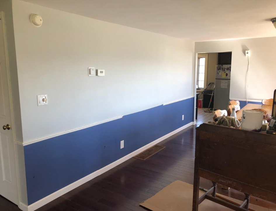
One of the main issues when we first saw the space was that our client had intended to paint her walls a navy blue, but as with so many well-meaning home owners, she selected a color that looked completely different than what she expected once she got it on the walls. Paint can be such a jerk and it’s nearly impossible to get right if you don’t have the proper testing methods in place beforehand. After sampling a carefully selected group of white paints and navy paints, we landed on a deep navy and we were so happy when our client surprised us in the decision to go with it! The blue bounces perfectly off the warm wood table and even highlights the navy in their wedding photos.
We initially selected a light fixture (shown in mood board) that after installation just simply wasn’t working in the space. It was an open glass light so it was collecting dust and all sorts of light obsessed insects. We decided almost immediately we needed to find something new and thank goodness because the new light fixture really makes the space. The black accents tie in so well with the black in the rug as well as the black spindle chairs and the sconces above the buffet.
The living room was another area that had so much potential. Our client’s Grandmother was the previous owner of the home and had a really cute/cool midcentury style overhead light which we were able to keep and work it seamlessly into the overall look. Our client really only had one piece of furniture, a very “leggy” (and HEAVY) stone coffee table which was a great starting point and really works well with the whole look.
Our client expressed that she loved a camel colored sofa (shown below) and requested other upholstery items that wouldn’t show signs of stains. Almost every inspiration image she shared had a deep red rug, warm leather accents and lots of greenery! Our client gave us plenty of direction in the form of inspiration images so we had plenty to work with and were able to pull a look together very quickly. After a few tweaks, we had a final design schematic and we were ready to roll.
We had a request for a leather recliner which was easily worked into this space. We selected a leather that would provide a nice contrast to the leather sofa, avoiding any matchy matchy vibes!
Whenever possible, we try to steer our clients towards custom window treatments as they truly make the space and are simply gorgeous. Off-the-rack just doesn’t compare…and neither does price tag. To save costs, this client had her family friend sew these curtains for their space with a fabric we selected to work with the colorful vibes we had going on. We purchased a muted gold rod with wood finials to tie into the wood and gold from the overhead light and the full-length mirror in the corner.
Plenty of greenery, lots of texture and some boho pillows brought the whole look together.
We are so grateful we had the opportunity to work on this project for this couple. It was the first bohemian project we had the pleasure of working on and it was so enjoyable! If you know anyone in the Central New York area looking to bring some style into their home, please share this project reveal. We are a small business always looking to take the guesswork out of design while bringing style and function to our client’s home.


