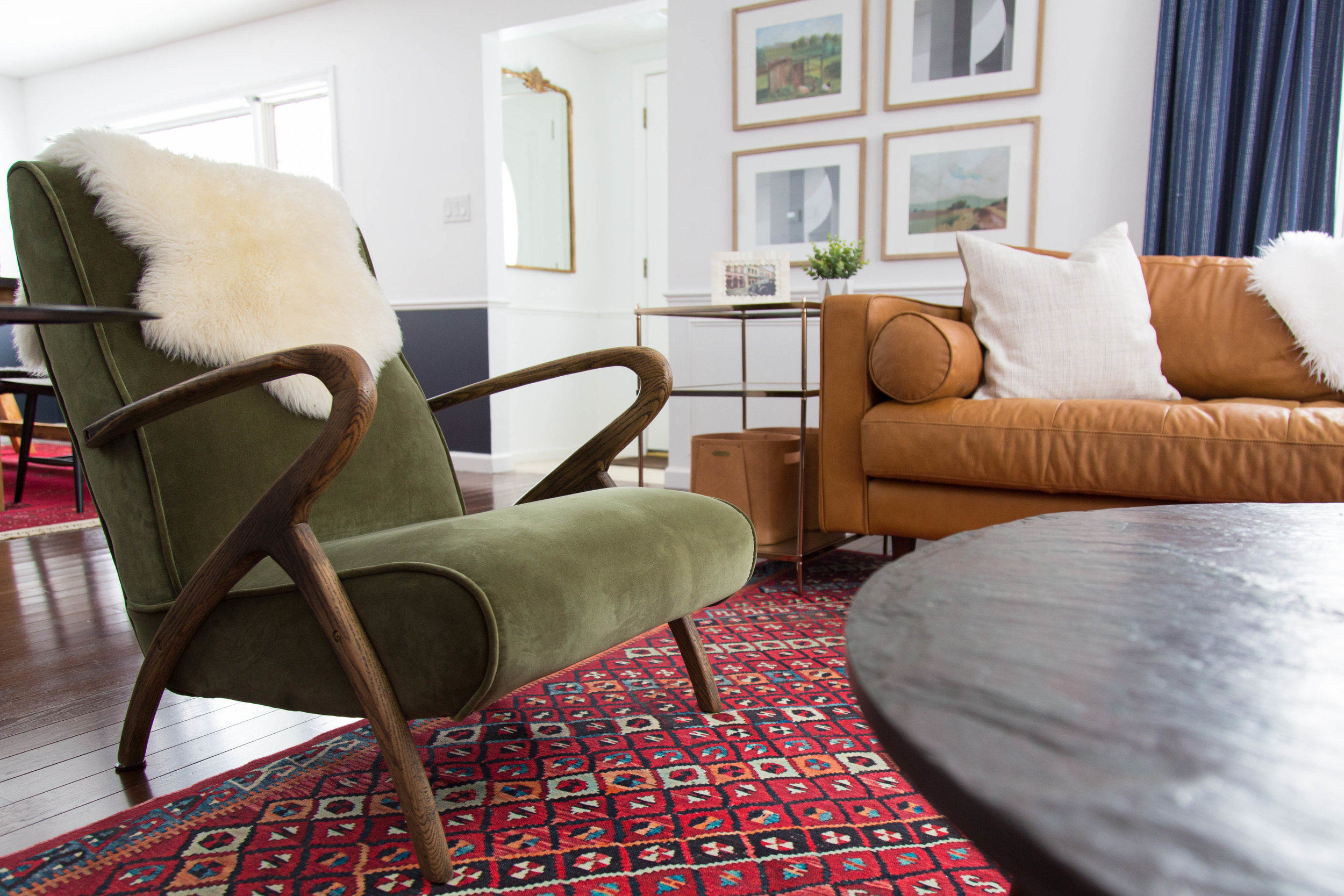
Space Planning and an Overcrowded Room
How to get it right before you start purchasing!
A couple of weeks ago, we discussed how poor color choices could be ruining your otherwise well-designed space. We cover everything from paint selections to the overall color scheme and even some common mistakes you’ll want to avoid. Read that article here.
This week, we will dive into how space planning, or lack thereof may be your issue.
Space planning, AKA considering ALL the elements of a room including windows, doors, walking paths, millwork, ceiling heights, lighting locations, outlets, and (most importantly) planned use of the space is the most fundamental step in creating a space that makes sense.
At the end of this article, it is our goal to have you design your space with this sequence in mind:
Measure → plan → purchase.
Here are some spatial issues that may be causing your room to feel off…
Overcrowded
Not enough furniture/undefined space
Ignoring vertical space
Today, we will focus on overcrowding your space and we will delve into the other two issues another time.
How do I know if my room is overcrowded?
If you can’t easily walk between pieces of furniture or between a wall and the closest piece of furniture, then your room is probably overcrowded.
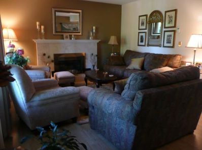
Both of these rooms, though wildly different, are overstuffed with furniture. One is a lot more attractive given the beautiful colors, but I can’t see myself easily moving around either space. Try to ignore the fact that the image on the left is the fashion equivalent of a Moo-Moo and just take notice of the overcrowded space.
To get you started, here are a few specific measurements you’ll want to consider when planning a living space:
36" - minimum space between seating pieces:
This distance (36”) does not necessarily refer to all seating pieces. You certainly won’t want two sofas across from one another to be any less than 36” apart, but more importantly, if you would like to/need to pass between two pieces of furniture to access the space, they should be at least 24” apart, but often 36” is even more ideal.
The image below is meant to illustrate that this “rule” really only applies if a passageway is needed between pieces of furniture. Oftentimes, as shown here, a table may be placed strategically to encourage a specific foot traffic flow in the space. This room likely has foot traffic flow through the area to the left of the accent chairs. The minimal spacing between these pieces also allows the chairs to feel joined together.
24" - minimum distance to allow for passageway between a wall and a piece of furniture.
Sometimes you want a piece of furniture off the wall but you do not necessarily need to pass through that space so in that case (like the second image here), you do not need to account for the 24” minimum.
12" - comfortable distance between a chair/sofa and an ottoman. This number merely allows you to account for this space as you plan your walking passageways in and around the seating area.
18" - ideal distance between your sofa and coffee table.
78" - ideal distance between the floor and the lowest point of your living room chandelier, pendant, or ceiling fan. Because heads will be passing directly underneath this fixture, you’ll want it to be high enough that even a tall person can comfortably pass underneath it without ducking. Apologies to the 7-footers out there! If your chandelier is directly over a coffee table, this number can be even less.
Area rug #? - a specific dimension cannot be assigned as an appropriate size for an area rug. You simply need to plot out all of your furniture pieces and then find a rug that (at a minimum) allows for all front legs of your furniture pieces to rest on the rug. That being said, in my opinion, it is much more desirable to have all furniture pieces resting entirely on the area rug. There is very little chance you can get away with less than an 8x10 rug and more than likely, you’ll need something bigger to really define your living space.
Here is an example of an area rug that isn’t necessarily wrong, but since only one of the seating pieces live on the rug, it feels a little undefined, unintentional, and colder than it otherwise would with a larger area rug.
Remember: Measure → plan → purchase.
Even just a basic floor plan (drawn to scale by hand) can be extremely useful. Use graph paper, do your math and get it right the first time! Notice how this drawing has a very basic layout with their table size listed along with the specific amount of walking space between each piece of furniture and it’s adjacent wall.
The amount of space this person allowed for passing between the wall and the table is not sufficient, but in some cases you may choose to ignore the guidelines if you need to accommodate more people in a smaller space.
We use a program for 3D renderings to really bring a space to life, but for anyone not in the business, there’s a space planning program on the Thomasville website that will allow you to do a simple floor plan just like this one we did for a client last year:
If you know what items you need and in what size, now all you need to do is worry about style, colors and budget.
Next time, we will review how to avoid the other major space planning mishap...not have ENOUGH furniture.


